Deliverables Created:
- Logo Redesign
- Package Design
- Box Design
- Mockups
- Website Design
PHASE 1:
The Heaven’s Gold project is an ongoing project, and has been one of our less traditional. This client has been very cooperative, and has a great vision for what they want their brand to look like. When they came to us, they already had a logo, but it was poorly done, and the name of the company was different, so we decided to recreate it in a much more organized way.
We started off by recreating the logo and changing the name. This is what we came up with.
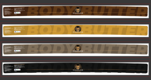
From here, we started on our package design. This required many iterations, as there was a lot to work with and get perfect, along with the trial and error that comes with printing designs at a print shop. This took some time, but ended up being exactly what we wanted.

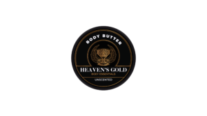
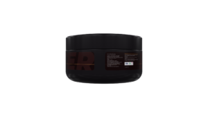 After this, we created their website. This website is still in the process of being built out, but the design is finished, and that’s what we would like to showcase today. Here’s what we designed.
This concludes our creation of brand materials for Heaven’s Gold. If any of our clients have changes they want to make, or dislike the direction as a whole, we are always willing to go back and iterate further. Sometimes changes have to be made, and that’s ok! If we missed something, and need to make minor changes, let us know and we can fix it right up. If the changes are more drastic, such as starting over, that can always be done as well! Once the changes have been made (or not, if the client really likes what we’ve come up with), we move to the final phase, where we deploy the designs.


